
Choosing the Right Interior Door Colors to Match Your Flooring and Walls
When designing a cohesive modern home, interior doors are often overlooked, yet they serve as the vital visual bridge connecting your vertical walls and horizontal flooring. Choosing the right interior door color is not just about aesthetics—it creates a seamless flow and can make a room feel twice as large. To achieve a perfectly balanced space, expert designers rely on structural color harmony to ensure that doors, floors, and walls complement rather than clash with one another.
| Flooring Tone | Wall Color | Recommended Door Color | Design Vibe |
|---|---|---|---|
| Light Oak / Natural Wood | Warm Cream / Alabaster | Pure White / Matching Oak | Japandi & Nordic Minimalist |
| Dark Walnut / Espresso | Off-White / Light Gray | Matte Charcoal / Deep Walnut | Modern Luxury & Executive |
| Modern Gray Tiles / Concrete | Crisp White / Cool Gray | Matte Black / Slate Gray | Industrial & Ultra-Modern |
| Traditional Red / Cherry Wood | Soft Beige / Ivory | Classic Warm White | Timeless Elegance & Transitional |
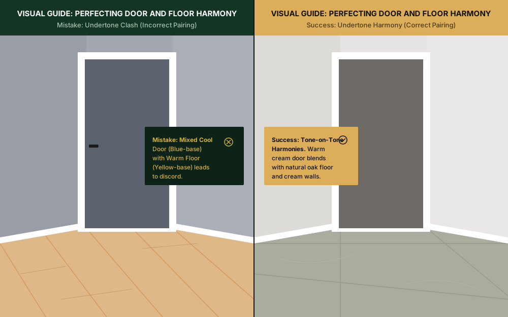
Mastering Undertones: Why Cool and Warm Shades Cannot Clash
The most common mistake in interior color matching is ignoring the hidden undertones of wood grains and paint finishes. Even if you choose a standard gray door to match modern gray tile flooring, mixing a warm, yellow-based gray door with a cool, blue-based concrete floor will instantly make the space feel discordant.
Before finalizing your door finishes, always sample them alongside yo 1 ur flooring under both natural daylight a 2 nd artificial lighting. For instance, classic red oak flooring carries intense warm undertones that demand a timeless warm ivory or soft cream door frame to blend smoothly. For ultra-modern spaces utilizing cool-toned marble, stick to sharp white or matte black door systems to guarantee a flawless, high-end “Quiet Luxury” aesthetic.
The Psychology of Contrast: Dark vs. Light Door Coordination
While matching your doors exactly to your flooring creates a safe, cohesive look, introducing thoughtful contrast is what elevates a project from standard to custom-designed. In modern residential architecture, leveraging contrasting tones is a powerful tool to manipulate the perception of spatial dimensions and ceiling heights.
Choosing a dark interior door—such 1 as matte charcoal or deep espresso—against crisp white walls creates a grounding architectural anchor. This approach works exceptionally well 2 in wide corridors, drawing the eye forward and establishing a clear sense of rhythm. Conversely, pairing light-toned doors with darker flooring prevents a room from feeling overly enclosed, bouncing natural light across the space to maintain an airy, open atmosphere.
Ready to Build the Future of Resilient Architecture?
How do WPC door systems compare to traditional timber in humid climates?
Traditional timber doors absorb moisture, leading to warping, swelling, and paint peeling in bathrooms or coastal projects. KEST WPC systems are designed for strong moisture resistance in humid environments; actual performance depends on the selected material, finish, installation, and maintenance.
Should my baseboards and door trims match the door color?
For a seamless, modern architectural look, we highly recommend matching your baseboards, door trims (casings), and the door slab in the exact same color. This creates a clean, continuous frame that elongates the walls. However, if you are going for a bold “statement door” (like a matte black door), using white trims to frame the dark door is a fantastic way to add sharp, contemporary contrast.